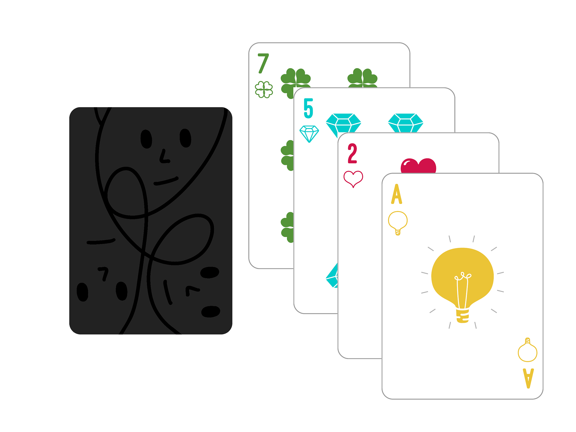

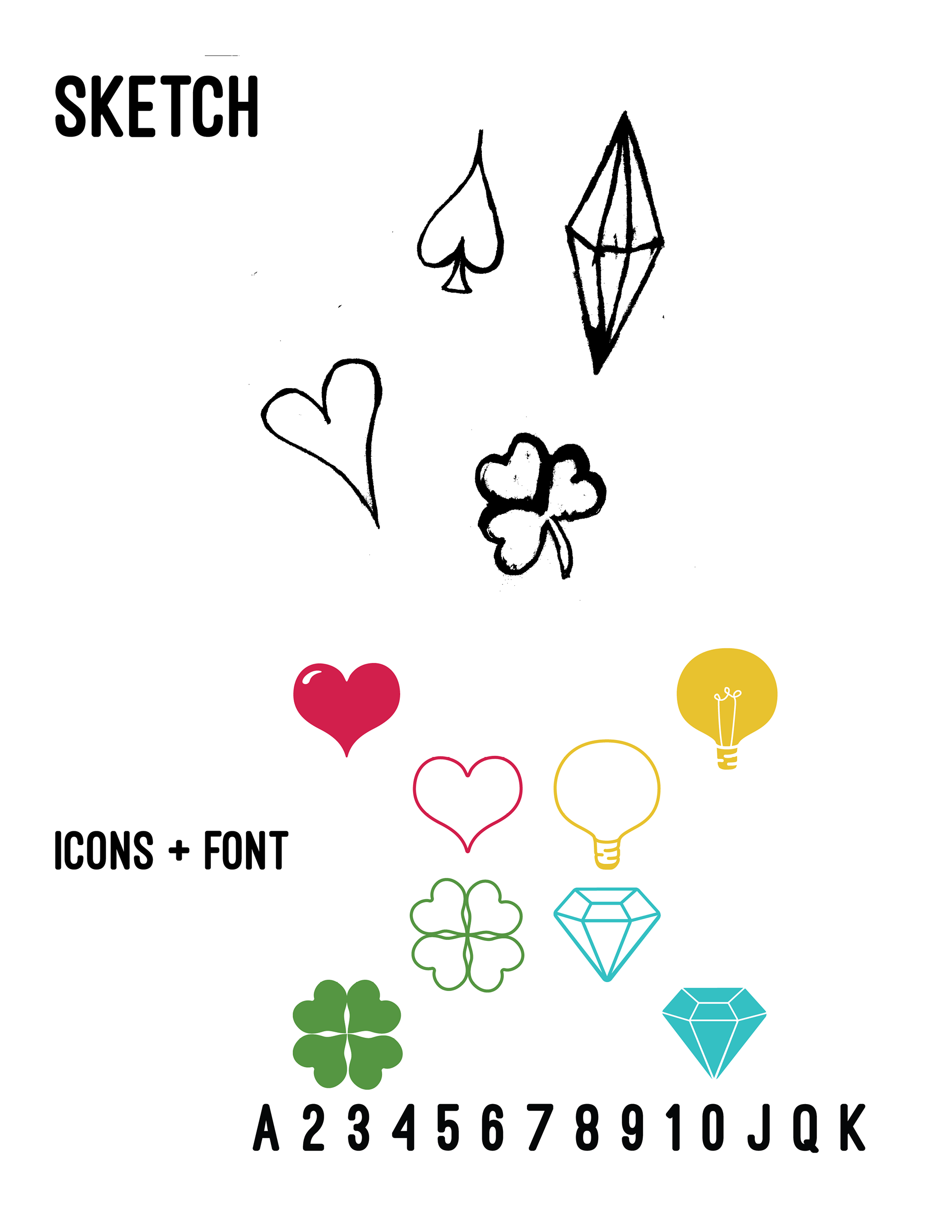
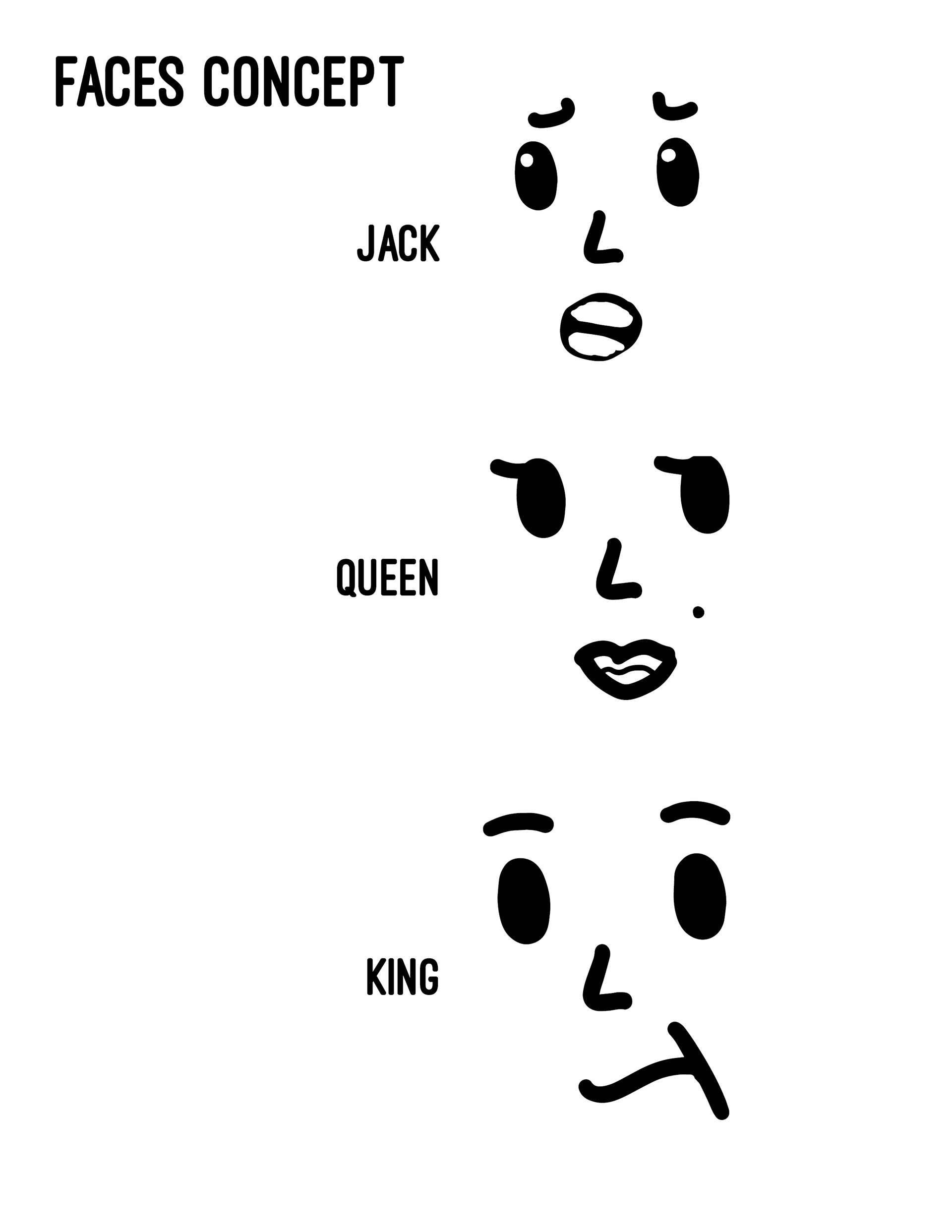

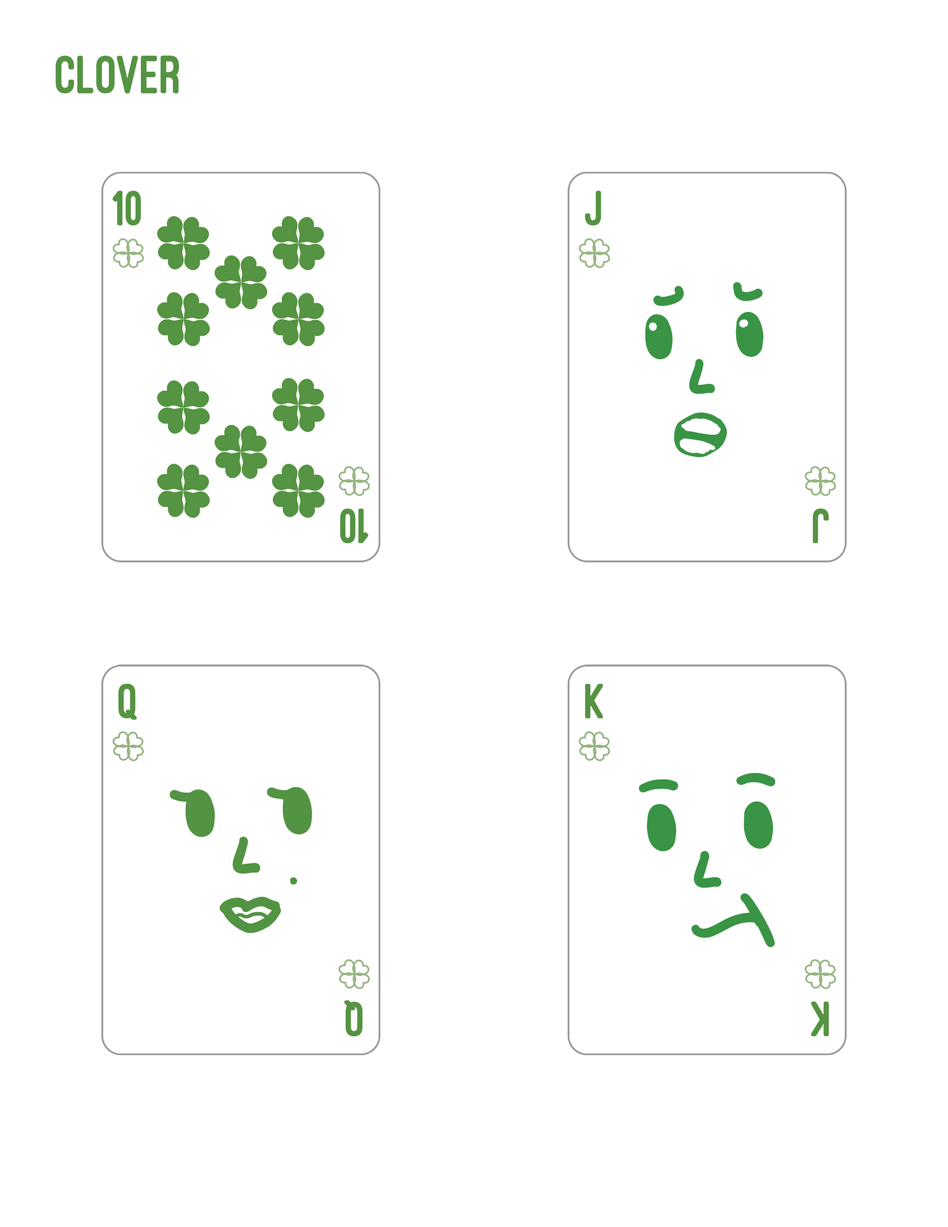
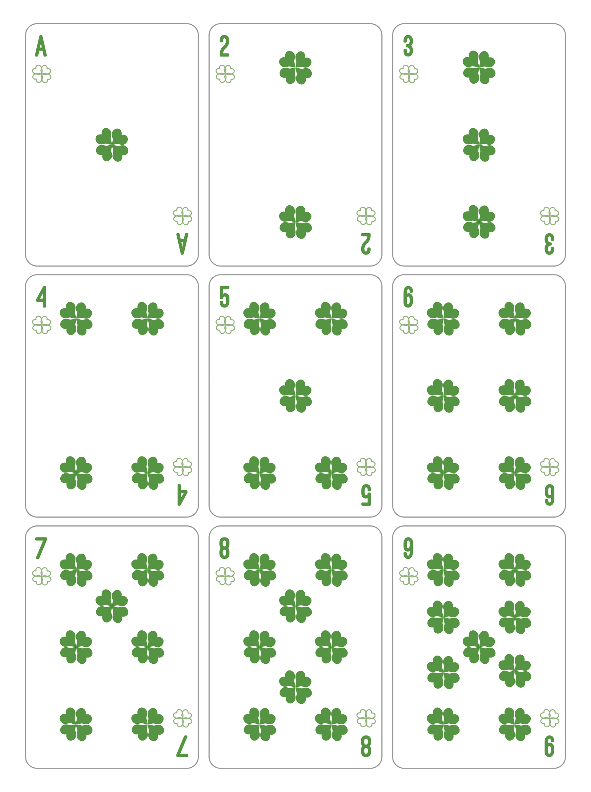
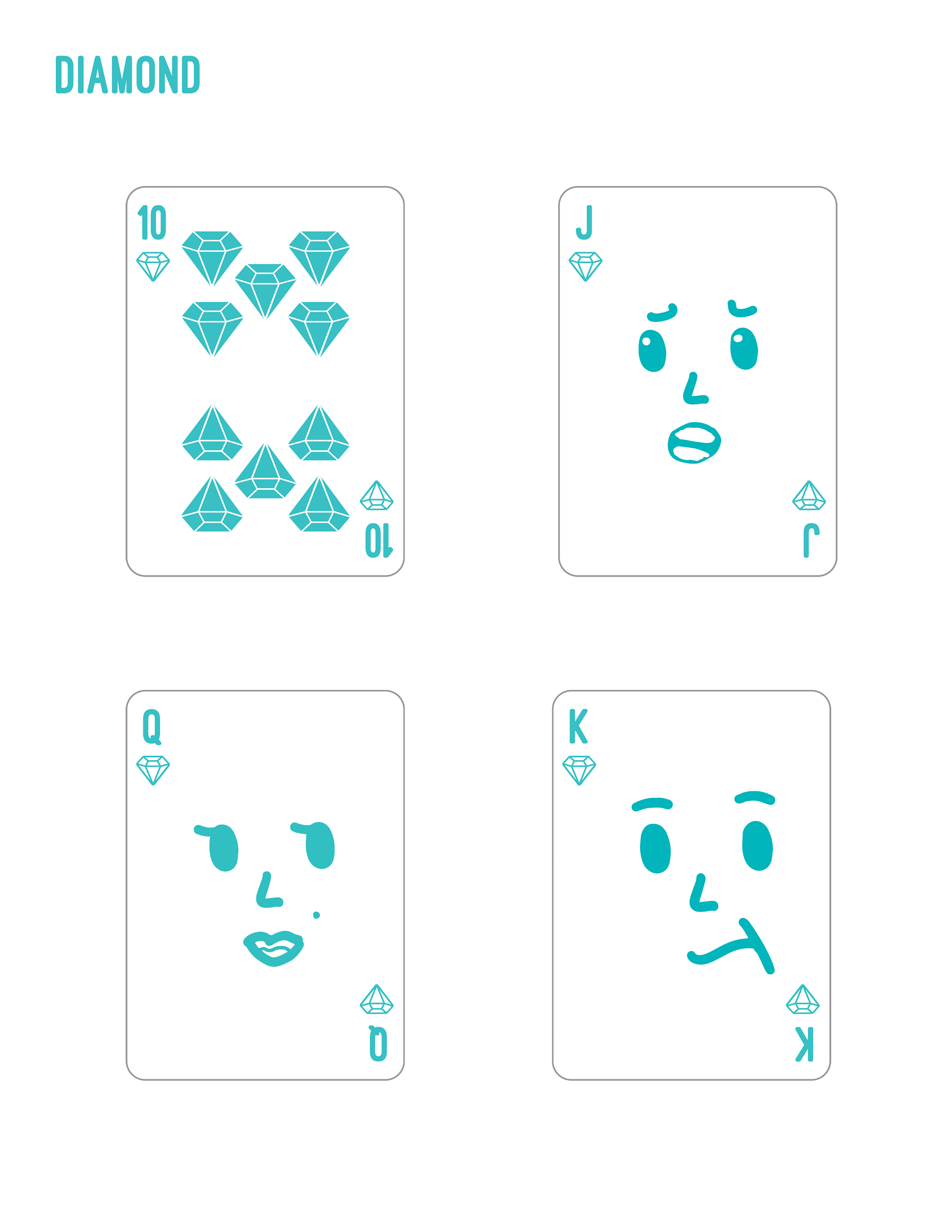
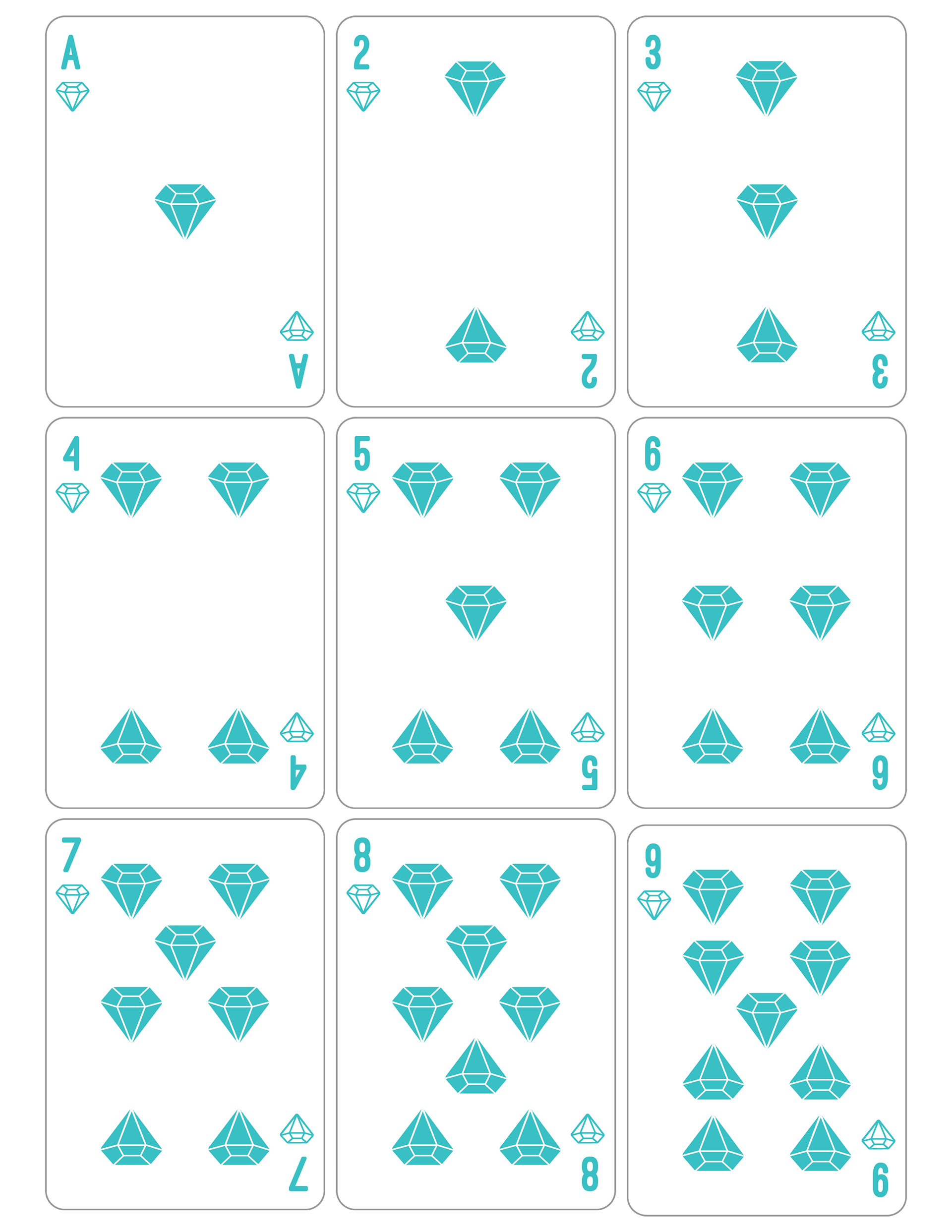
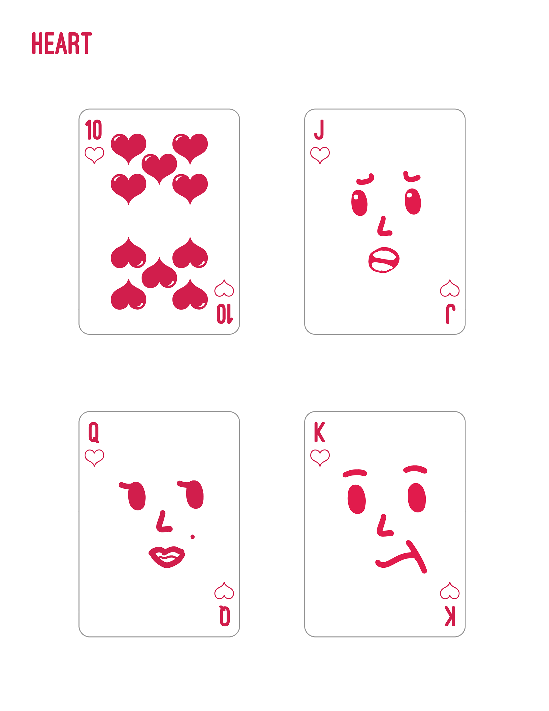
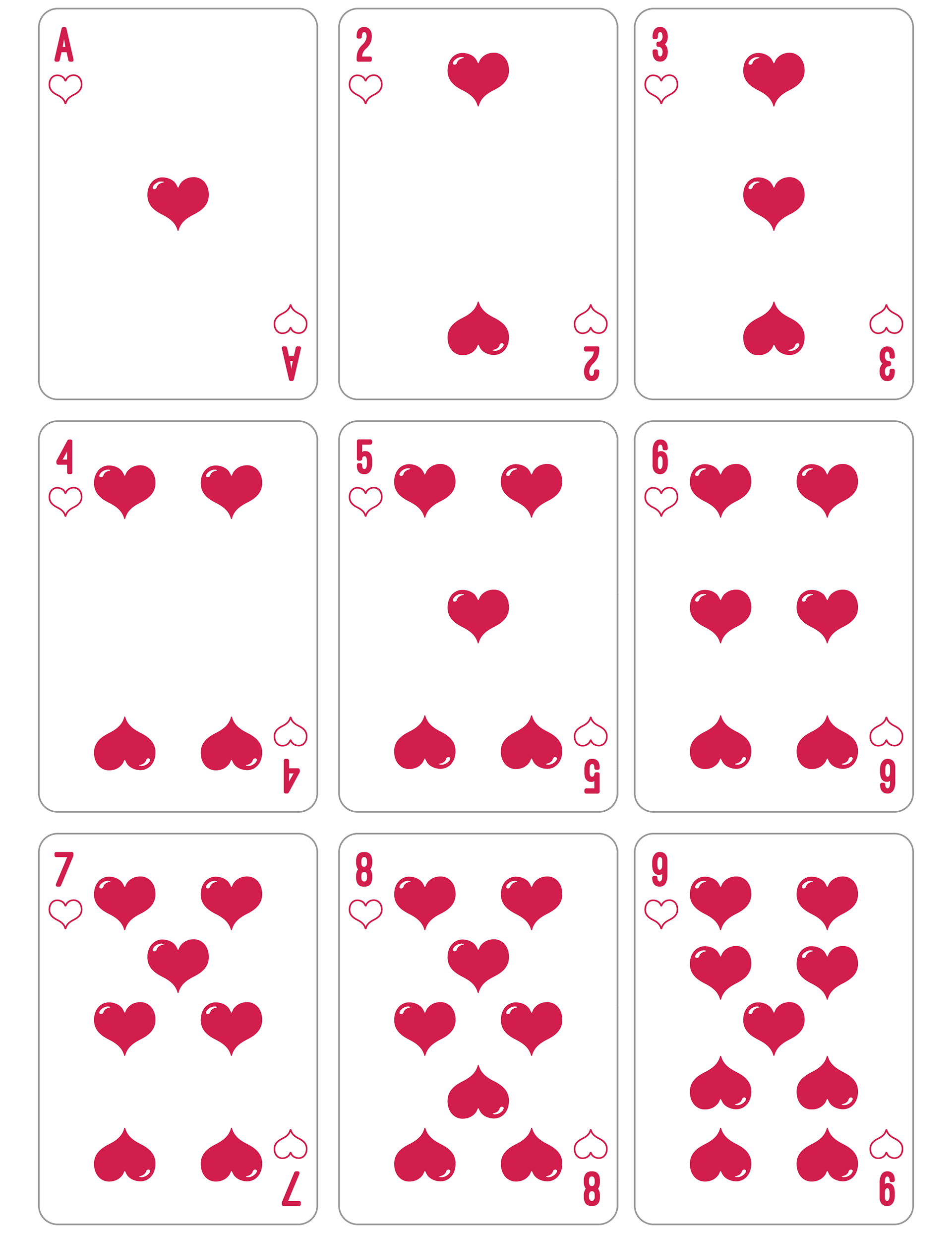
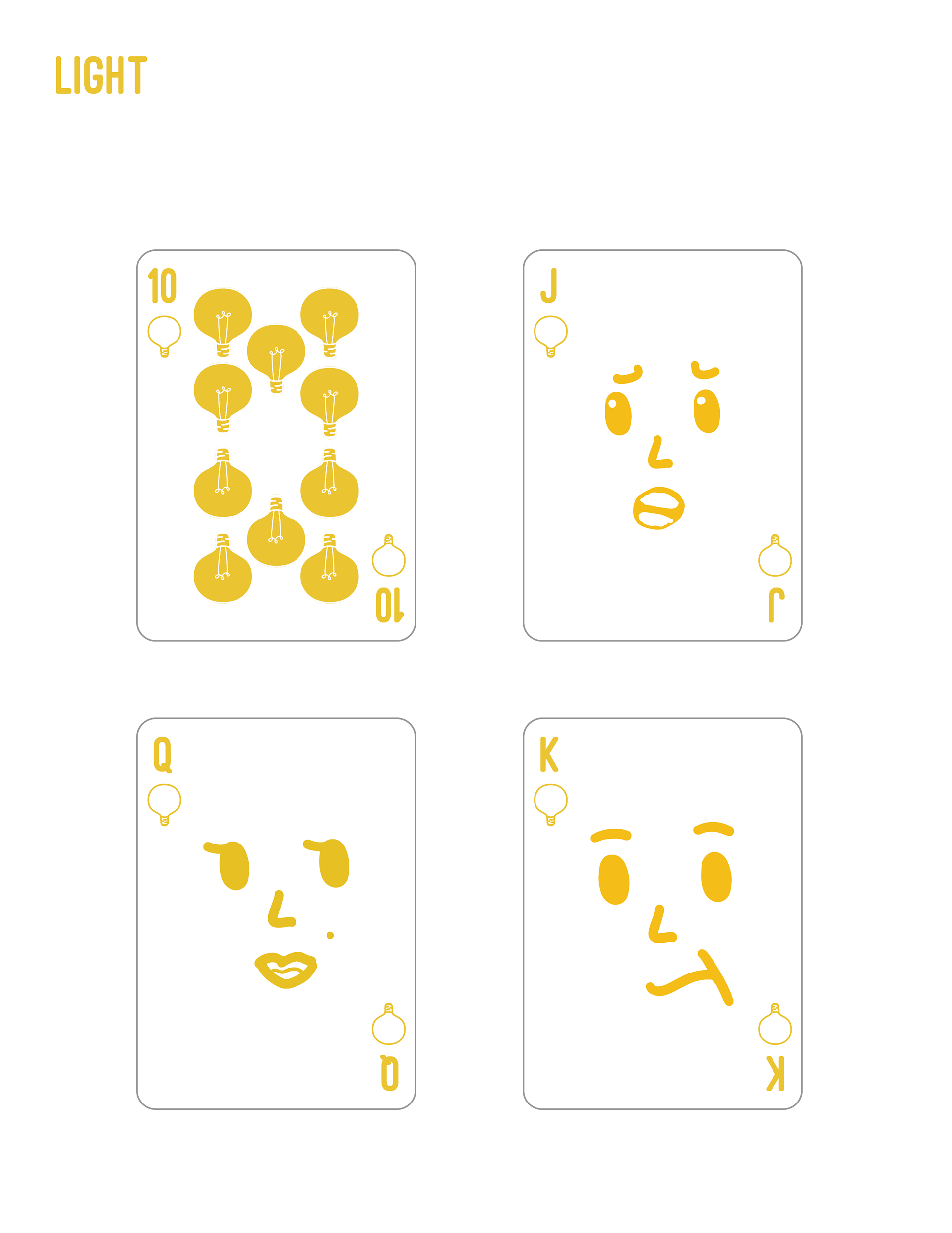
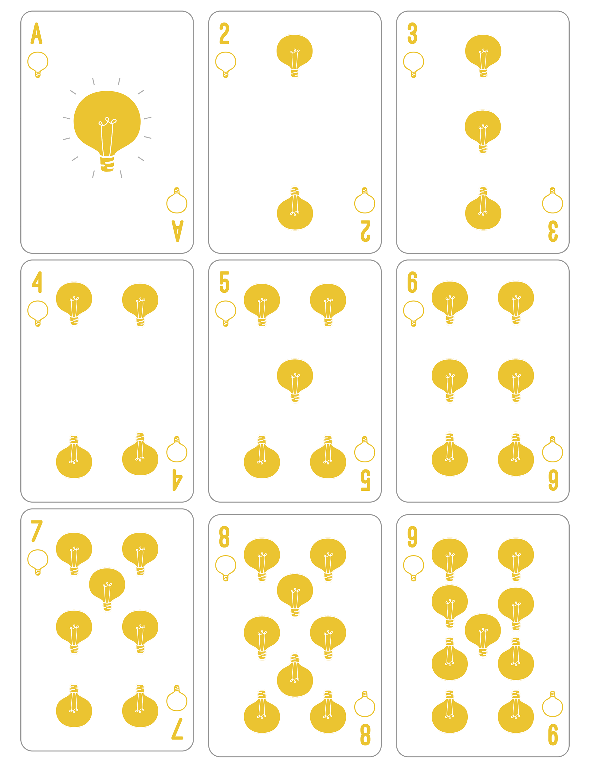

Graphic Design, Illustration A standard deck of cards has looked more or less the same for centuries. Two colors. Four suits representing the pillars of medieval society. Face cards with ornate, mirrored portraits. It works — but it's never been the only way. This redesign started with a simple question: what would a deck look like if the suits meant something to the world we actually live in? The four new suits — heart, diamond, clover, and lightbulb — map to love, material possession, luck, and intelligence. Each gets its own color: magenta-pink, teal-blue, bright green, and yellow. The palette is bold and distinct, making suits readable at a glance without relying on the red-black binary we're conditioned to expect. The face cards took the longest. For years the Jack, Queen, and King sat unresolved — I couldn't find faces worthy of them. Then one day the answer arrived in the most obvious form possible: literal faces. The Jack grimaces. The Queen preens. The King smirks. Simple, readable, and just expressive enough to have personality without being portraits of anyone in particular. Built in Illustrator and InDesign, this project stretched across several years of on-and-off work — not because it was technically complex, but because some design problems deserve to wait for the right answer.